Saturday, November 12, 2011

Macro Storytelling

I've always found macro cinematography to look amazing when well lit and properly used. Recently I've noticed a trend of storytelling that uses macro throughout the narration. Here are a few fantastic examples

Burger King: California Whopper
by Pysop


Karl X Johan - Flames (dir. cut)


Friday, November 11, 2011

Music Video of the Week

Amon Tobin - Calculate
Over the past year I've become more and more a fan of creative 2D animations. This music video is a great example simplistic/complex animation matched with the beat. At first glance it's child like in simplicity but as the song progresses the complexity gets to the point of... "how the heck did he do that!" 


Infographic Animations that you can't help but pay attention to

The world of infographic animations is relatively new. It's the idea of taking something that would normally be seen in as a print diagram and animating it as the narrative explains what you're seeing. This is a animation style I'm very familiar with having done many myself for the company Column Five Media which specializes in infographics.

TakePart: Waiting For 'Superman' - Infographic
This animation is done by the legendary Jr.canest, a lead animator at Buck in LA. The animation techniques he uses keep the eye focus on what is important and never make the eye go board. By sequencing his mask it creates a flowing organic feel that hits right as the brain is ready to transition. This animation set a new standard for what is possible 2D infographic animations.


Gates Foundation – G20 Summit
Another amazing animation by a new studio in the motion world called Gentleman Scholar. This was their first infographic animation and they really nailed it. The action is constant and the transitions are powerful, moving you from one place to another seamlessly without confusing the audience off of the narrative of the piece. There are so many good things to say about this animation but in the words of Jr.canest:

Jr.canest pro 7 days ago
Well done gentleman, well done. :D


Sexy GUI by Kim Holm

GUI (Graphic User Interface) has made a very prevalent appearance in many modern movies today. Usually it's on a screen or some sort of plane that the user can interact with. Kim Holm takes a different approach to this GUI by having a motion tracked interface that is simply beautiful.

Matta - Release The Freq
This is a fantastic compilation of something simple made into a complex hierarchical dubstep mashup. Fantastic edits and color correction make this music video entertaining to the bitter end.


Matta's Soundcloud:
soundcloud.com/​matta-music


Kongsberg - Opening Titles
Another excellent example of motion tracked GUI. It's always interesting to see how the user can interacted with this digital world that is seemingly at their fingertips.

Thursday, June 23, 2011

Resonance


Resonance is the vision of SR Partners; a collaborative project with over 30 independent visual and audio designers/studios. The aim was to explore the relationship between geometry and audio in unique ways. 

This abstract collage of short clips is an amazing example of what can be done with high quality sound effects and top notch animation.

SEE || Displace Studios and MoveMakeShake | Esteban Diacono | Heerko Groefsema | Jean-Paul Frenay | Jr.canest | KORB | Kultnation | Mate Steinforth | Matthias Müller | Momentary People | MRK | Murat Pak | Onur Senturk | Physalia studio | Polynoid | SR Partners | Thiago Maia | Tom Waterhouse | Tronic Studio | Spatial Harmonics Group

HEAR || Audionerve | Combustion | CypherAudio | David Kamp | Echolab | Hecq | Michael Fakesch | Mutant Jukebox | Radium Audio | Box Of Toys Audio | Studio Takt | World Gang

resonance-film.com for more details and opportunities to get one of the limited edition Blu-Ray and DVD versions of the full film.

Tuesday, May 3, 2011

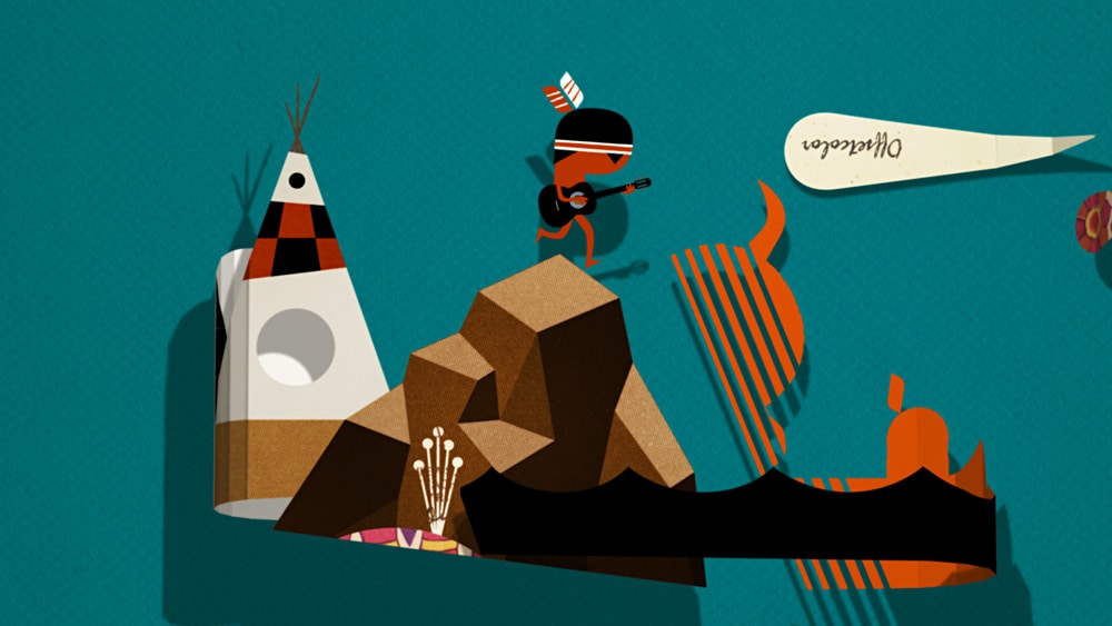
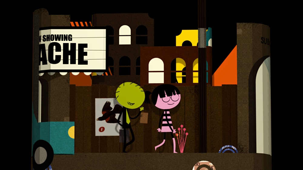
Apache by Oeedo


What was the concept behind the spinning environment in the piece?
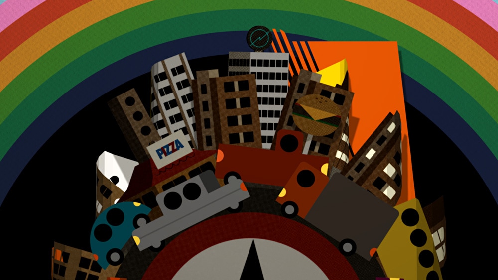
I had a rough, hazy idea for what happens in the video based on the music. The pace of the music suggested traveling to me. I liked the idea of the Apache traveling from his home via different old fashioned modes of transport and finally getting swallowed up the modern city, giving a sense of nostalgia – similar to the start of the film ‘Midnight Cowboy’ with it’s track ‘Everybody’s Talkin’. The spinning environment came out of a need to find an interesting way to show this. I started with a panning background. To show distance and visualise his journey of where he’s coming from and going to, I folded the picture plane twice, creating an ‘S’ shape which then moved off to exit screen. The spinning environment came out of that, I just thought it would be cleaner and more concise. The layering of action came out of exploring the new possibilities of this style, the fact that you can have simultaneous scenes overlapping like a cross dissolve is quite exciting.
How did you execute the concept and what types of mixed media where used?
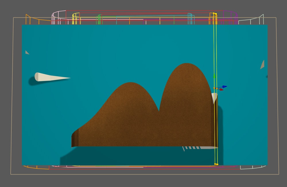
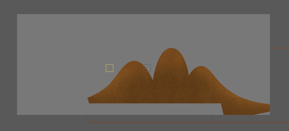
The video was created in After Effects with imported files from Illustrator, textured in photoshop. I had 3 main comps that ran the length of the video, one for the inside loop, the middle loop and the outside loop. The backgrounds panned inside these comps (pic A) and the main action happened in the centre. These comps were then taken into the final TV res comp and turned into 3D. I then duplicated each comp about 10 times and masked along the comp (pic B). I attached each section to the one previous and rotated all of them on the Y axis to form the bend. I then masked the ends so that the action dissolves to nothing.
The style of the environments and characters is very graphic. Was there a particular inspiration for this approach?
I do like things to be simple. I’m attracted to mid 20th century design but I don’t tend to get locked into a style. I like to explore things graphically through shapes and have something come out of that. A bit like a magpie, I’ll find a shape for a nose I like and use it on one character but use something different for another character. I like the concept of collage of styles within illustration.
Altogether, how much time did the piece take you from start to finish and how was the working relationship between yourself and the band, Danger Beach?
I contacted the band at the end of Feb this year and I worked on the video in my spare time finishing it last week. It’s a self initiated video, I do these to explore Illustration styles and modes of storytelling that I don’t get much chance to do in my commercial work (www.hoverlion.com). The band was understandably very happy.
Do you have future plans to continue working in the music video genre?
Yes, I think the simple combination of music and animation is one of the best things going. I’ve made a few already and I do plan to make more. It’s just a matter of finding a track that sparks something I want to say in animation.

CREDITS:
Director: by Ned Wenlock
Character animation: Rodney Selby
Music: Danger Beach on Dream Damage Records.

Sunday, April 24, 2011

Tim Minchin's Storm the Animated Movie


Stylistically amazing, great story line, excellent use of typography, awesome use of graphical techniques and very well edited to keep you interested the whole time. This short animation really impressed me to say the least. Also, very well put counter argument to the fairytale speaking people out there. Check it out!